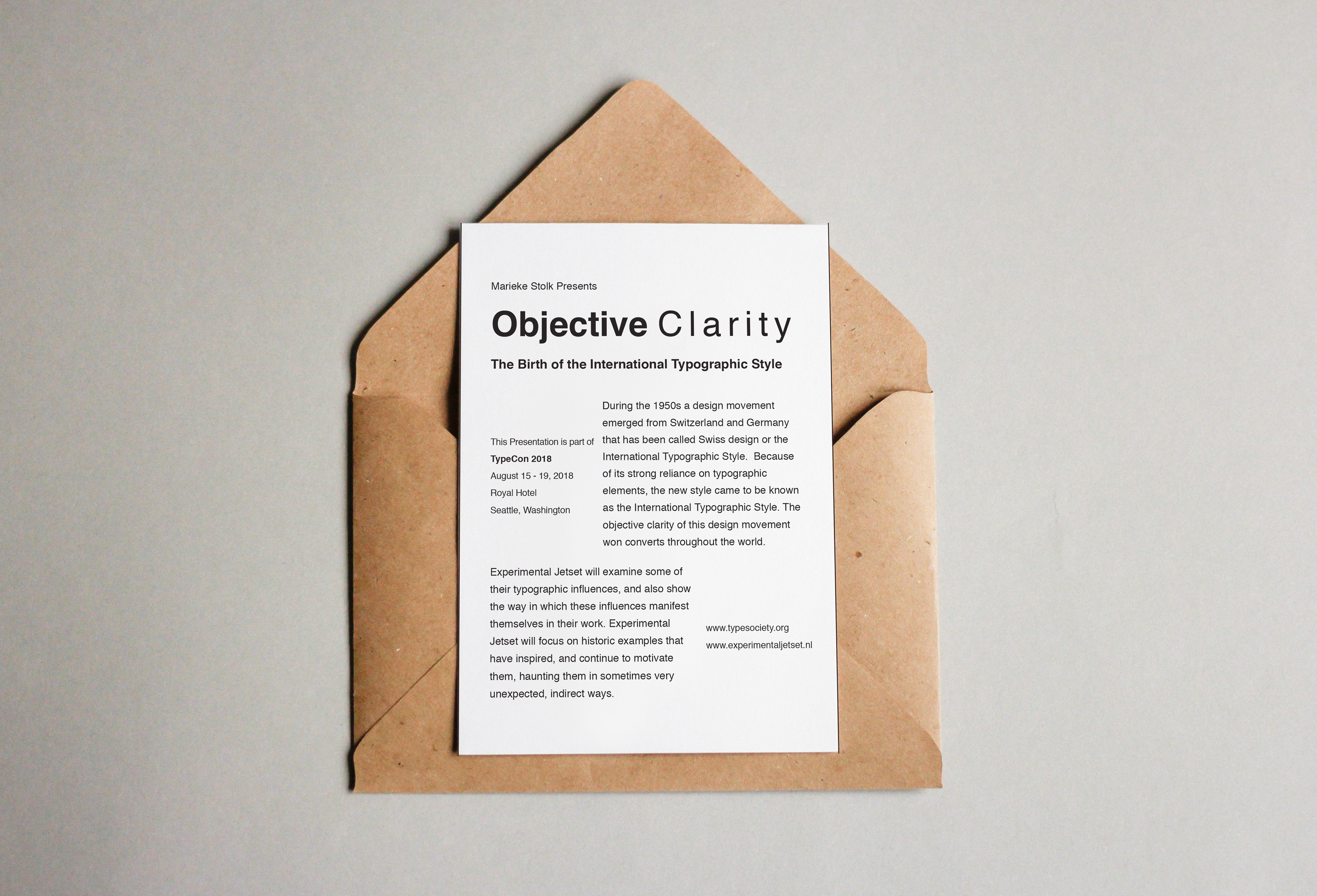
Since the title of the invite was “Objective Clarity, I wanted to make the text clear, easy-to-read, and simple.I utilized grids and columns to create visual variation without the use of graphics or any other embellishments, in the fashion of Swiss International style. Typefaces Used: Helvetica - Regular and Bold
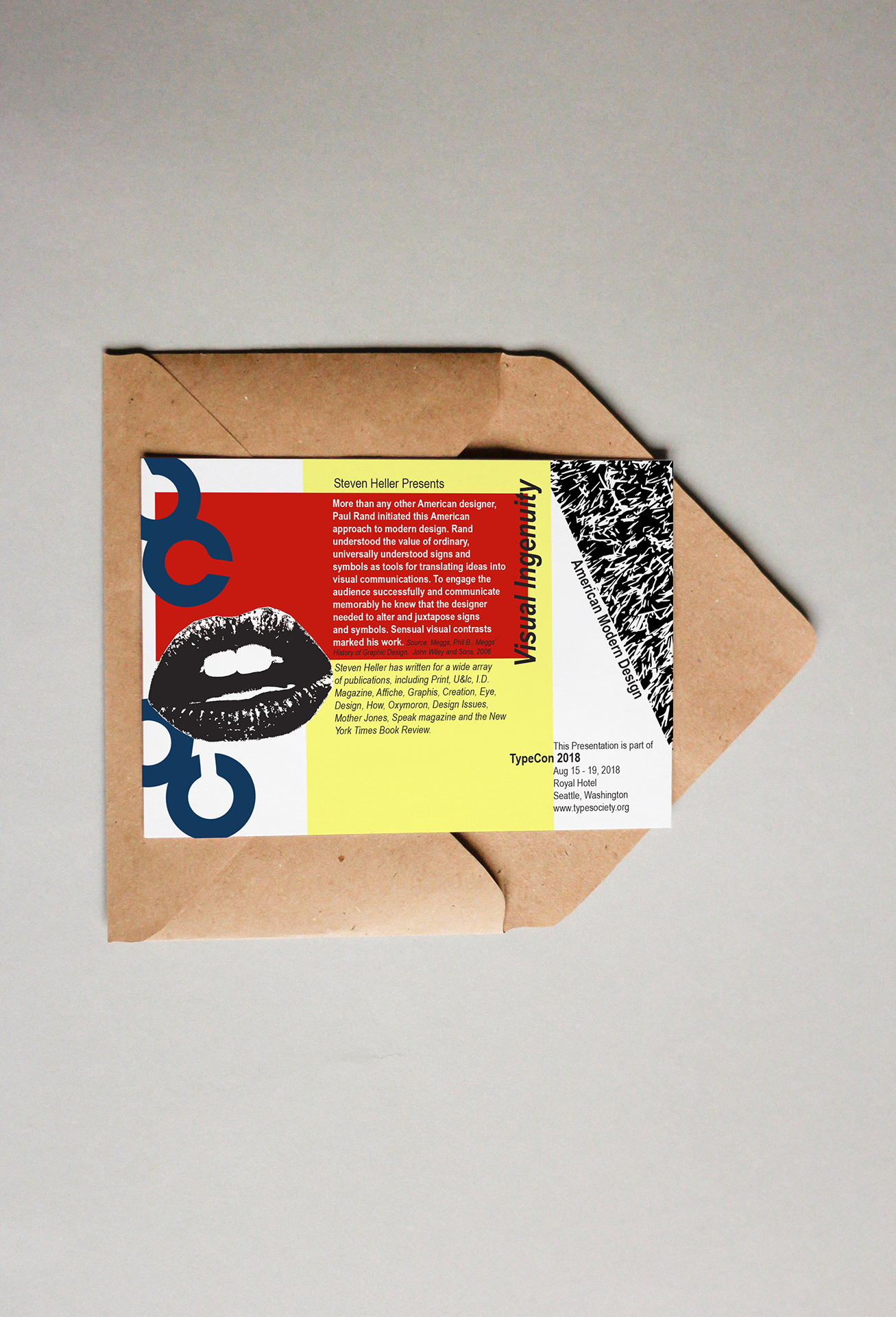
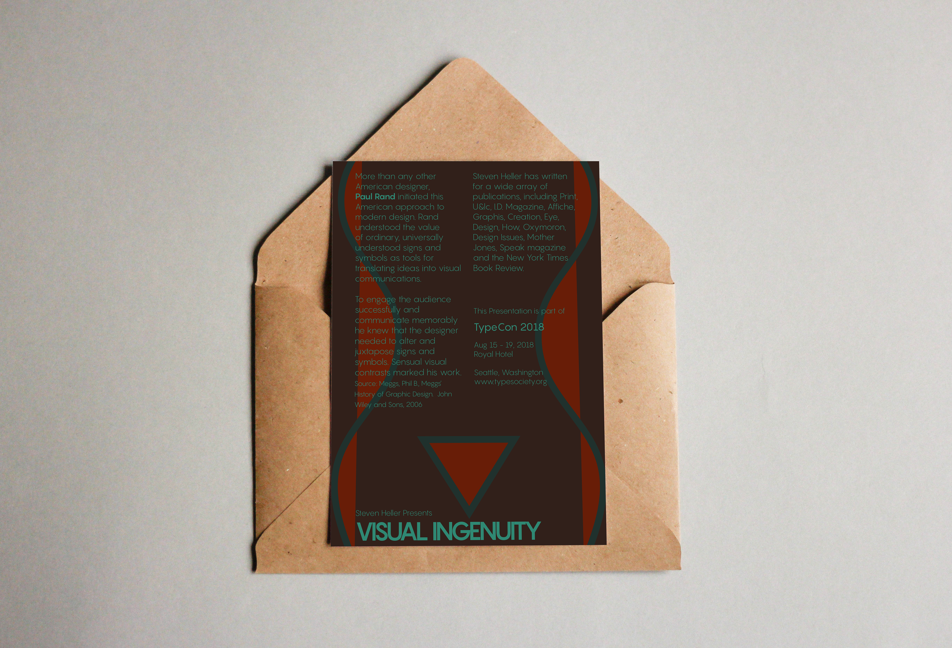
For this invite, I wanted to incorporate elements of Paul Rand’s work to convey the importance and iconic nature of American Modernism. I decided to take a collage-style approach, including Rand’s “c”’s and other modern imagery. I used some colour blocking and played with type rotation and use of space. Typefaces Used: Arial Narrow - Regular, Italic, Bold, Bold Italic
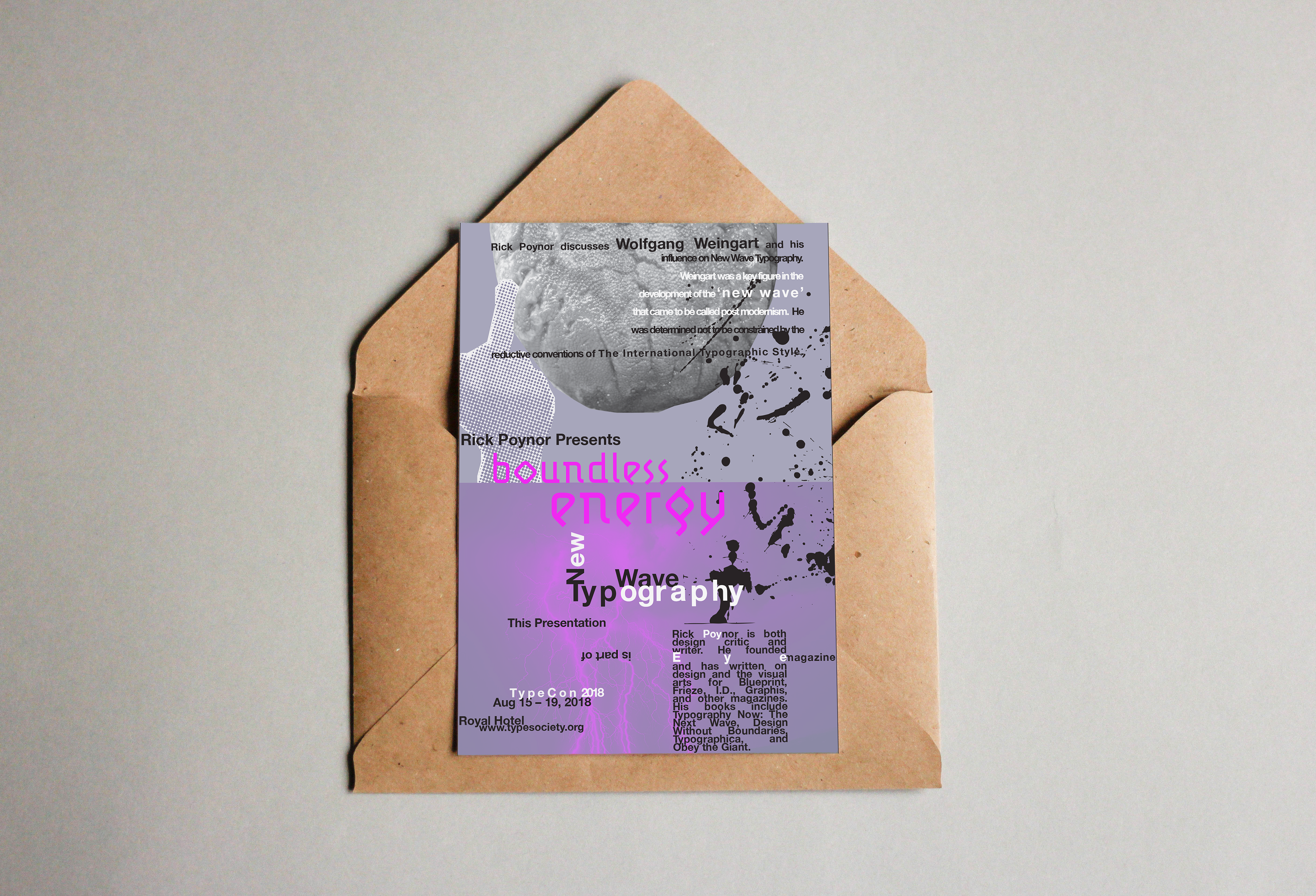
For this invite, I wanted to convey the innovation displayed by Wolfgang Weingart over the course of his career by using his unusual typesetting strategies as inspiration. I wanted to explore what I could do to make a classic typeface feel uncomfortable, unusual, and unconventional. Through kerning, leading, type size, and other variation, I created an intentional sense of haphazardness. The background imagery is mostly inspired by the title “Boundless Energy,” with the cheeky middle finger reflecting Weingart’s attitudes towards, rules, regulations, and tradition. Typefaces Used: Helvetica Neue - Bold, Lunatix OT - Light